THE NICHOLSON RIVER WINERY LABEL
Here is a brief history of our label and its development.
Our winery began in the late 1970’s and early 80’s, a time when there was great excitement about bringing European sensibilities of good food and wine to Victoria. The wines of Burgundy, Bordeaux and Chablis were highly praised, and were the inspiration for many budding vineyard/wineries in Victoria. The French sense of pride they had in their regions’ produce was palpable and enviable. We were part of a large group of pioneers who set out to show that parts of the ‘New World’ could make wine (and food) as good or better than the Old one – and to bring locally made product to the table of Victorians.
It was in this environment that the Nicholson River Winery label was developed.
Together with local artist Jenny Toye, we worked on creating a label that spoke to and of the area. It symbolises what we represent – the Gippsland Lakes region.
The Map
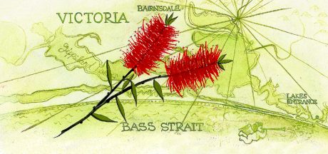
The idea for the map background came from a label we had seen on a bottle from the Loire Valley. Jenny drew the map of the Gippsland Lakes by hand. The map also came in handy when describing the location of the winery to people from Melbourne (or beyond).
The Flower
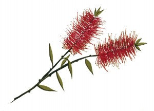
Flowers on a wine label is well known. Famously, Murray Robson of the Hunter Valley had a red rose and a yellow black eyed Susan. (He also personally signed every label!)
We chose Calistemon citrinus, the Crimson Bottlebrush, for our label. It is endemic to our region and was the emblem of the Bairnsdale Shire at the time. It is now one of the most widely-grown natives in Australia and overseas. The flower is a symbol of nature, beauty and locality. Jenny Toye drew it by hand, and it was adopted as our distinctive logo.
The Letterhead

Jenny used the swirling, curling letters of the Nicholson River Winery label from a local artist who had a sign on the road around the corner from our property. From memory, it read ‘Nicholson Art Portraiture’. It has evolved slightly over the years, but it retains its unique, old world feel.
Our label is quite ‘Olde Worlde’, reflecting the French traditions that we follow – and a nod to age of our home, which dates back to the 1880’s.
The Name
Finally, why didn’t we call ourselves ‘Eckersley Wines’, or something similar? For the same reason we included the map and flower – it’s all about locality, and being proud of where we come from. It is a very French notion – that of ‘terroir’, that the soil and climate create a unique wine (or food), like a fingerprint. We were on the Nicholson River, so that would be the name.

Developments
The earliest labels show the rolling hills, river and young, untrellised vines from the hill overlooking the vineyard. The wine was made from grapes bought from the Murray region. Note the sticky tape holding it on, and the stamped variety and vintage.
In 1985 we opened our cellar door to the public. These are the front and back labels we used to showcase our wares. The map and bottlebrush are still virtually unchanged.
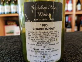
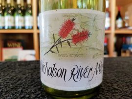
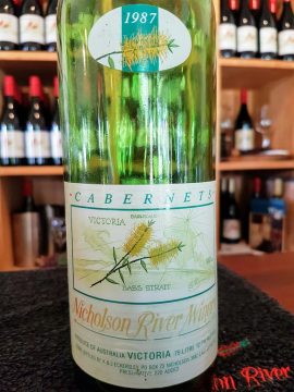
Two years later and we were trying out placing a vintage label up high, and a strong border around the map. These were put on by hand, or with a rudimentary, one-bottle-at-a-time machine.
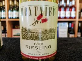
In the late 80’s we introduced the ‘Montview’ range of wines, and experimented with a very different look. ‘Montview’ is the original name of the property and homestead.
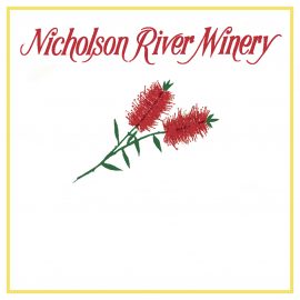
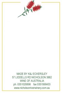
For a short time we removed the map, having received criticism that the label was ‘too busy. This new label was universally condemned!
In maintaining a tradition, and attempting to be a little ‘less busy’, we returned to the dark green map in the background and then in 2010 had the flower refined. This is our label as it looks today:
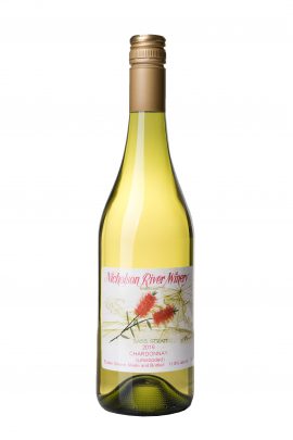
Will it stay the same, or are there more changes to come? Only time will tell …

